Showing posts with label G324 Research and Planning Print Productions. Show all posts
Monday, 27 March 2017
Sunday, 26 March 2017
Thursday, 23 March 2017
Wednesday, 22 March 2017
Tuesday, 21 March 2017
Monday, 20 March 2017
Monday, 23 January 2017
Visual Styles Case Study - Optional piece

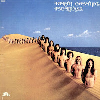
Whilst looking for examples of realism based album covers, I stumbled upon the band Birthcontrol. After doing a bit of investigating into the rest of their album covers I found a clear motif for the realism style. Pictured above are 3 of their album covers which all use the realism art style in a unique way.
Image 1, the cover for the album Plastic People.
This album features a long line of people coming off of what appears to be earth. Each of these individuals of which we can see are different. The first person has a clock for a face, the 2nd looks normal, the 3rd has his gas mask and further down the line is a religious figure. Perhaps the title "Plastic People" is reference to how when people take on a profession they become absorbed into it and that becomes what personifies them.
The realism style is clear from the face of the first character. The everyday item of a clock has been morphed into a person to create an image which doesn't show reality. Realism is also used in terms of the planet that the line of people are coming off. It could be Earth, but its not the Earth that we know. Instead it is a distorted perception of our reality.
The image of the band members coming out of the sand dunes has gone down the same route.
Abstract
After finding some examples of abstract album covers online, I wanted to investigate how I could go about making something of a similar nature.
This image was created through dropping ink into a bowl of water. I had a go at making a similar image using paint but the desired effect wasn't achieved. I liked this idea however, one of my group members is already using it so I can't really copy it. Which gave me the idea to create an abstract image similar to this one but by using a different technique that will give the image its own originality| The self titled album from Factory Floor |
With the bands name being "Tempesst" and a tempest being a violent storm, it would connote the chaos which is associated with the word.
I found the above images on the Mirror80 blog. The blog focuses on the combination of retro ideas and styles with a modern twist to them. The first image, the sand pineapple, is an image that I really like. It isn't of a contemporary style and its really out there. I haven't seen any pieces like this before and I would like to create an image of a similar type and see how it could be incorporated into my print production. The image also has the flavours of surrealism thrown in as well with the image not being representative of anything realistic. There is a clear motif developing on how I would like my work to look. I want to use abstract ideas whilst maintaining a minimalist style.
The second image of the rock uses contrasting colours effectively to create a soothing image. I really like the colour schemes used here and am thinking of incorporating a contrasting colour scheme into my print production.
Thursday, 19 January 2017
Possible visual styles
When looking for inspiration for my print production, I wanted to find examples which conveyed the genre of the band Tempesst and the song Tidal Wave through its images. This inspired me to find texts of a psychedelic nature. For my print production I want to stray away from the norm and use some abstract ideas. However, I didn't want to limit myself to just the psychedelic art style, so I found some examples from other art styles as well which might be appropriate for my production.
Psychedelic


The above pictures are album covers from the artists Jimi Hendrix & The Underachievers respectively. Psychedelic art is any art that is inspired from the psychedelic experiences and hallucinations which take place after the ingestion of perception altering substances such as LSD and psilocybin. The art style became popular during the 1960's with the emergence of the hippie movement which was well renowned for its widespread use of psychedelics.
The characteristics of the art style include bright contrasting colours, patters, the morphing of objects and the repetition of symbols or images. All of these features are included in the above examples.
Both album covers feature the musician(s) at the forefront of the album cover, surrounded by ancient gods. It is quite clear that The Underachievers album is inspired by Hendrix's. There is repetition of these gods in the background. The background of Hendrix's album features a pattern with contrasting colours which add to the psychedelic look. UA feature contrast by having the animals that come out of them having both colour and black and white renditions on the album cover. These animals are also used to represent the morphing of objects, they are not in their typical form and have been distorted to fit the psychedelic genre. Both albums feature old gods which connote ideas of divine beings which are not of this world. Some psychedelic users say that when they trip it is like being in another dimension and that they see things that are not of this world. This links the covers to the psychedelic genre. The font on Hendrix's cover is very wavy and resembles the Hebrew alphabet, the alphabet which was used in biblical times and this links to the gods on the front cover and in turn to the psychedelic genre.
Surrealism


Surrealism is a style that began in the early 1920s. The aim was to resolve the previously contradictory conditions of dream and reality. Artists painted illogical scenes and created strange images from everyday objects and developed painting techniques that allowed the unconscious to express itself.
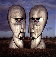
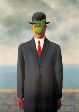
The above images are all prime examples of surrealism with Salvidor Dali's melting clock being the most famous. Pink Floyds Divison Bell album cover highlights how new strange images can be created through manipulating everyday objects. The cover features two totem heads facing each other, by placing in additional objects it creates the illusion of there being two faces. The album Plastic People is heavily inspired by the famous Son of Man painting. Both feature a human body with an irrelevant everyday object placed over it. This creates an irregular image that would never normally exist in the real world.
Surrealism is a style I could see working well for my print production. It wouldn't be too difficult to create surrealist images and it could be done using everyday objects. It fits the genre of the music video with it being an abstract art style. Perhaps I could incorporate the mask from the music video into the print production this way, a pivotal piece of the video, without it looking forced and unnatural.
Minimalist


Minimalism as an art style emerged in New York in the early 1960s. The concept of minimalism is to strip everything down to the bare essentials to achieve simplicity. Through this method, artists and designer alike have been able to develop pieces which are instantly recognisable and easy on the eye.
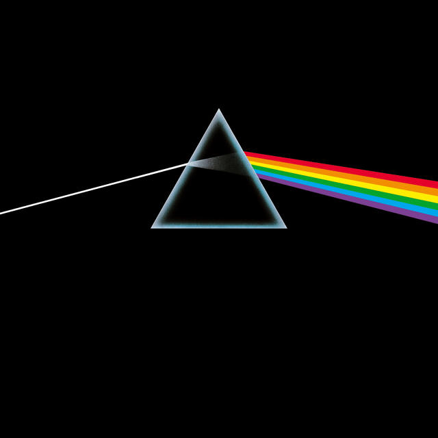
One such example is Pink Floyds Dark Side of the Moon album cover. The piece is simple, a ray of light reflecting through a triangle and producing a rainbow of the colour on the other side. This cover would be easy to make, yet its very effective at being recognisable. As soon as fans of music see the basic image they instantly know its Pink Floyds legendary album. The other music based example I included is a mock up of some other famous album covers which have been recreated in the minimalist style. All of these are easy on the eye and have a professional look to them. Minimalist as a style choice has became increasingly popular in recent years from advertising to the crests of world famous football clubs.
Using a minimalist style would make creating the print production an easier task than the other art styles. It would be easier to balance the images and to create a piece of work with a professional finish. However, I am not sure how well I would be able to convey the genre and tone of Tempesst through this art style and I feel as if it would limit the creativity and freedom I would have to explore an array of ideas.
Psychedelic
The above pictures are album covers from the artists Jimi Hendrix & The Underachievers respectively. Psychedelic art is any art that is inspired from the psychedelic experiences and hallucinations which take place after the ingestion of perception altering substances such as LSD and psilocybin. The art style became popular during the 1960's with the emergence of the hippie movement which was well renowned for its widespread use of psychedelics.
The characteristics of the art style include bright contrasting colours, patters, the morphing of objects and the repetition of symbols or images. All of these features are included in the above examples.
Both album covers feature the musician(s) at the forefront of the album cover, surrounded by ancient gods. It is quite clear that The Underachievers album is inspired by Hendrix's. There is repetition of these gods in the background. The background of Hendrix's album features a pattern with contrasting colours which add to the psychedelic look. UA feature contrast by having the animals that come out of them having both colour and black and white renditions on the album cover. These animals are also used to represent the morphing of objects, they are not in their typical form and have been distorted to fit the psychedelic genre. Both albums feature old gods which connote ideas of divine beings which are not of this world. Some psychedelic users say that when they trip it is like being in another dimension and that they see things that are not of this world. This links the covers to the psychedelic genre. The font on Hendrix's cover is very wavy and resembles the Hebrew alphabet, the alphabet which was used in biblical times and this links to the gods on the front cover and in turn to the psychedelic genre.
Surrealism

Surrealism is a style that began in the early 1920s. The aim was to resolve the previously contradictory conditions of dream and reality. Artists painted illogical scenes and created strange images from everyday objects and developed painting techniques that allowed the unconscious to express itself.The above images are all prime examples of surrealism with Salvidor Dali's melting clock being the most famous. Pink Floyds Divison Bell album cover highlights how new strange images can be created through manipulating everyday objects. The cover features two totem heads facing each other, by placing in additional objects it creates the illusion of there being two faces. The album Plastic People is heavily inspired by the famous Son of Man painting. Both feature a human body with an irrelevant everyday object placed over it. This creates an irregular image that would never normally exist in the real world.
Surrealism is a style I could see working well for my print production. It wouldn't be too difficult to create surrealist images and it could be done using everyday objects. It fits the genre of the music video with it being an abstract art style. Perhaps I could incorporate the mask from the music video into the print production this way, a pivotal piece of the video, without it looking forced and unnatural.
Minimalist

Minimalism as an art style emerged in New York in the early 1960s. The concept of minimalism is to strip everything down to the bare essentials to achieve simplicity. Through this method, artists and designer alike have been able to develop pieces which are instantly recognisable and easy on the eye.
One such example is Pink Floyds Dark Side of the Moon album cover. The piece is simple, a ray of light reflecting through a triangle and producing a rainbow of the colour on the other side. This cover would be easy to make, yet its very effective at being recognisable. As soon as fans of music see the basic image they instantly know its Pink Floyds legendary album. The other music based example I included is a mock up of some other famous album covers which have been recreated in the minimalist style. All of these are easy on the eye and have a professional look to them. Minimalist as a style choice has became increasingly popular in recent years from advertising to the crests of world famous football clubs.
Using a minimalist style would make creating the print production an easier task than the other art styles. It would be easier to balance the images and to create a piece of work with a professional finish. However, I am not sure how well I would be able to convey the genre and tone of Tempesst through this art style and I feel as if it would limit the creativity and freedom I would have to explore an array of ideas.
Thursday, 14 July 2016
Subscribe to:
Posts (Atom)
-
When deciding our song that we would create a music video for, we created a web chart that measured our shortlist of songs on their; broadne...